• Introduction:

    Do you ever wonder how we become attached to the movies and TV shows we love? Why do new trailer releases or merchandise drops feel so exciting? While we think of ourselves as fans of these things, our attachment to these fandoms we love is a lot deeper than we think. Our attachment is shaped largely by emotional design– the ways media use music, visuals, and interactive experiences to entertain audiences and foster loyalty. While we mainly see these emotional designs when movies and shows are being promoted, its branding sticks with us in our memory and helps us distinguish it wherever and whenever we see it. Through the deliberate use of color, typography, logos, and other design elements, media creators cultivate emotional attachment, strengthen fan loyalty, and build fandom communities.

    Plutchik’s Wheel of Color:

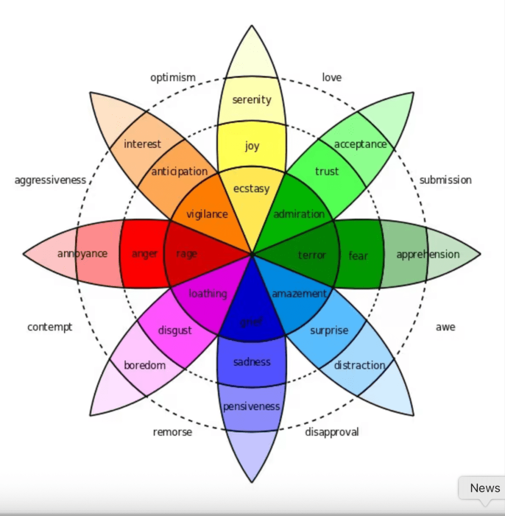
    An important element in entertainment marketing that draws us to the movies and shows we love is color. While color is mainly used to help convey emotions in a movie, it also hugely helps with a film’s branding. To make an emotional connection with fans, marketing teams use Robert Plutchik’s Wheel of Emotions. This was specifically designed to help people understand the nuances of emotion and how emotions contrast with one another. Within this wheel there are eight primary emotions: joy, sadness, disgust, anger, surprise, anticipation, and trust. He also uses different colors to represent each primary emotion, making it easier to distinguish and visualize feelings. In all of this, color psychology is very important to note since certain colors can elicit a physical or emotional reaction and, in doing so, shape human behavior (Keane 2025). Color is probably the biggest element to entertainment branding as it is applied with a movie or shows typography, costumes, lighting, architecture and more. Using color within these things adds to what we feel when we see promotions of our favorite movies and shows. 

    How Costumes Have an Emotional Connection With Fans:

    Costumes function as a form of sartorial fandom, allowing fans to translate emotional attachment into embodied identity. By wearing character-inspired designs, fans participate in the narrative world (Affuso & Scott).

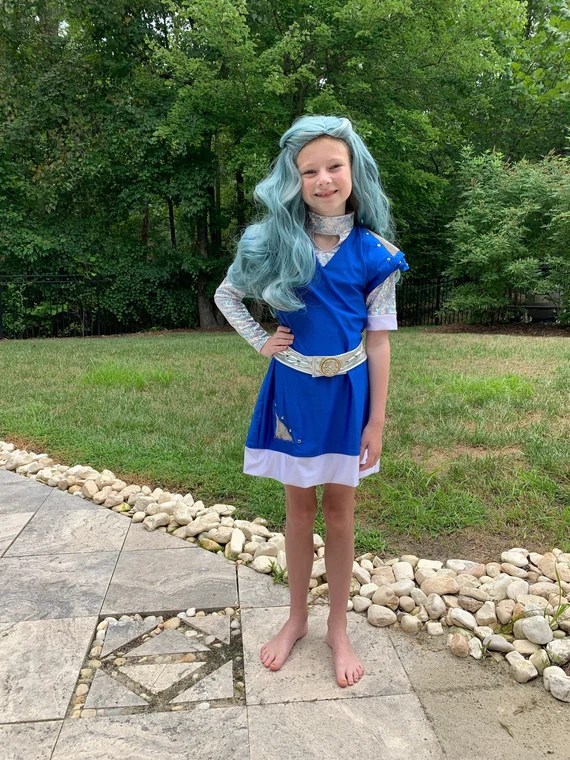
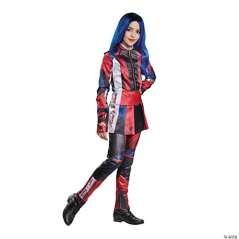
    Not only are costumes represent the character’s identity but it also allows audiences to show their emotional connection to movies and shows. These sartorial practices help fans express their identity, signal belonging, and help them get more involved in their fandom communities.

    For example, this summer when the Descendants and Zombies Tour happened, fans of Disney’s Descendants and Zombies movies dressed up as their favorite characters. transforming the concert as a space where fans could express themselves and feel in tune with their favorite characters. One might dress as Addison with her white hair and alien outfit as they feel the connection to her story about finding where they belong or dress as Evie as a way to connect with her feminine and fashionable energy.

    Colors are also a very important part of cosplay as specific color palettes help make characters more recognizable while reinforcing their emotional traits and narratives.

    Experience Economy / Norman’s Three Levels of Emotional Response:

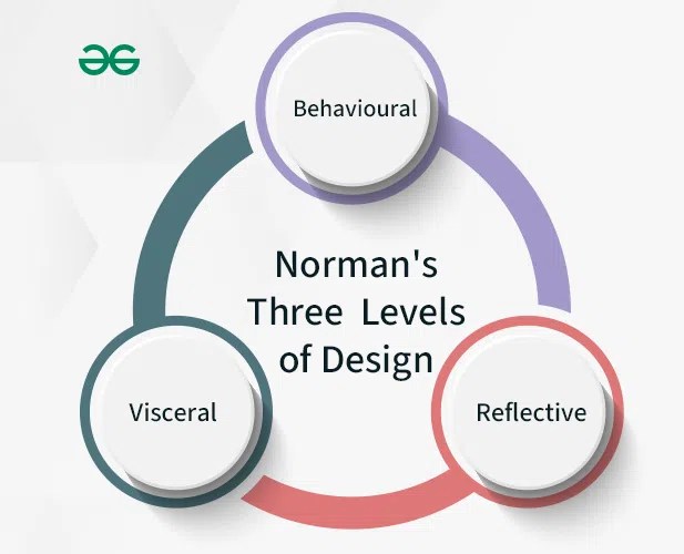
    Image: https://www.geeksforgeeks.org/software-engineering/normans-three-levels-of-design/

    In order to understand how emotional design fosters fandom attachment, it is important to understand the psychology behind it. A huge part of this is experience economy. Experience economy proves that not only does entertainment sell movies, shows or merchandise- it also sells immersive experiences that create emotional and memorable connections with audiences. These immersive experiences align closely with Norman’s three levels of emotional response: the visceral level, the behavioral level and the reflective level. The visceral level of design is when the viewer of the design reacts to such features based on only what they see in front of them and there is no further interpretation involved. Behavioral level of design is when designers attend to the function and use of product, such as interacting with a fan app, exploring a website, or engaging with merchandise, where the design enhances the user experience (Norman 2004). Reflective level is the highest and refers to the user’s reflections about a product. This can be before, during, and after use. 

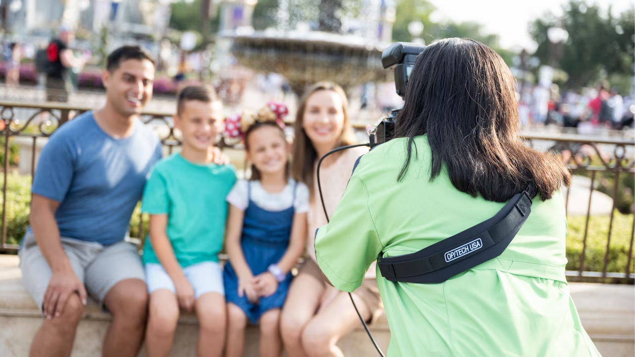
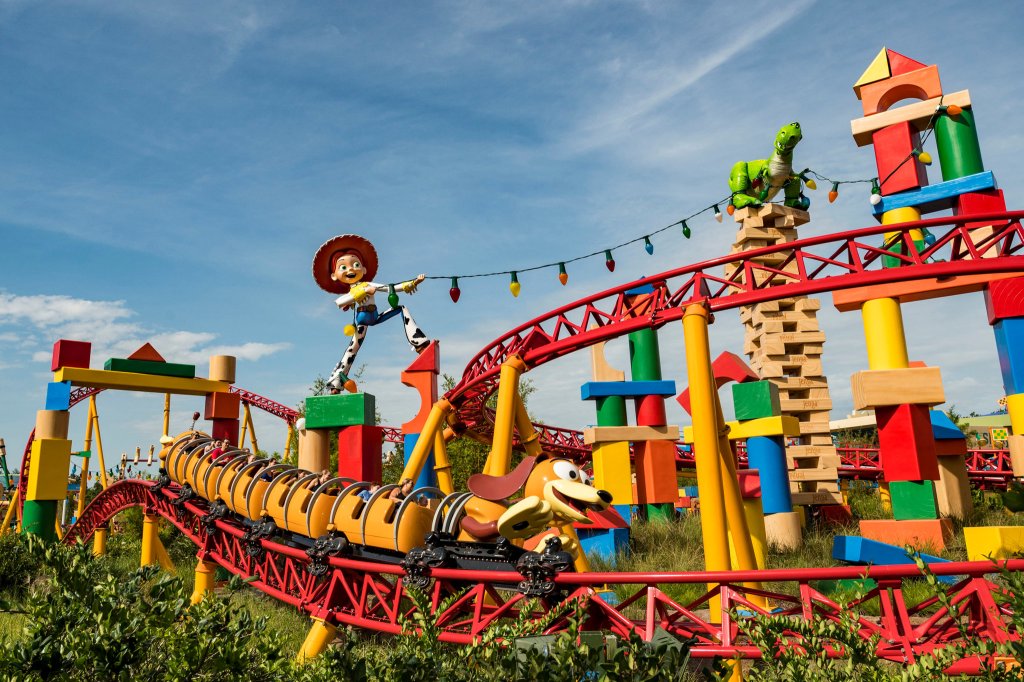
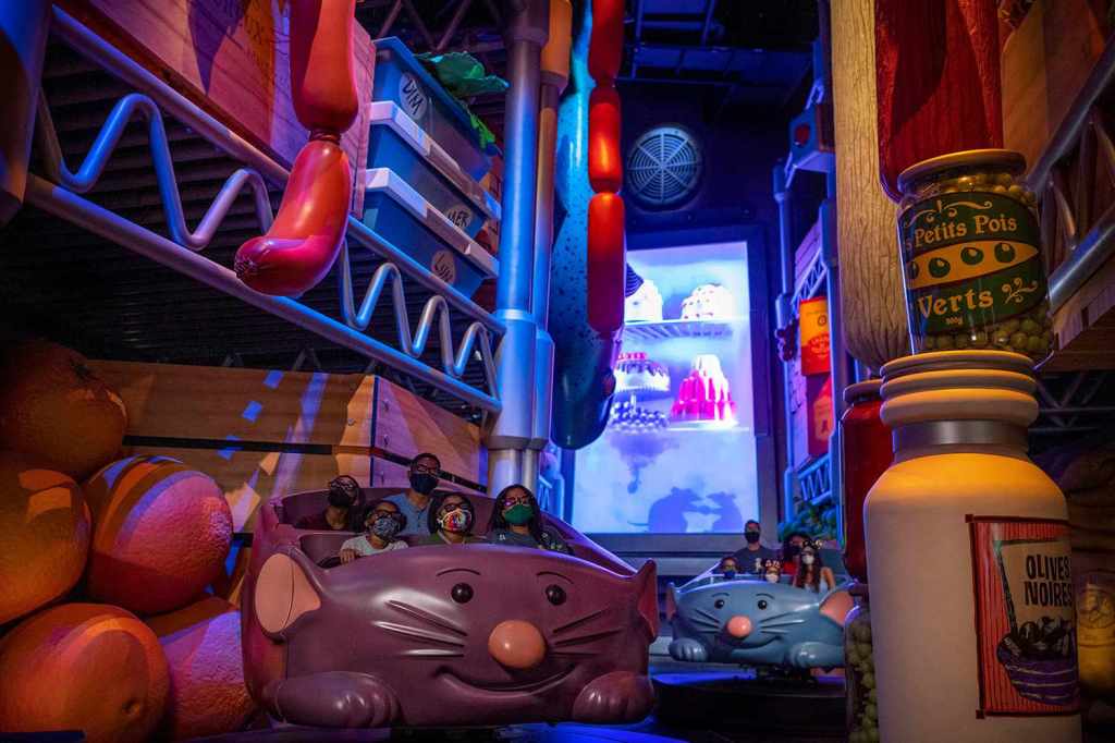
    Immersive Experience Example:

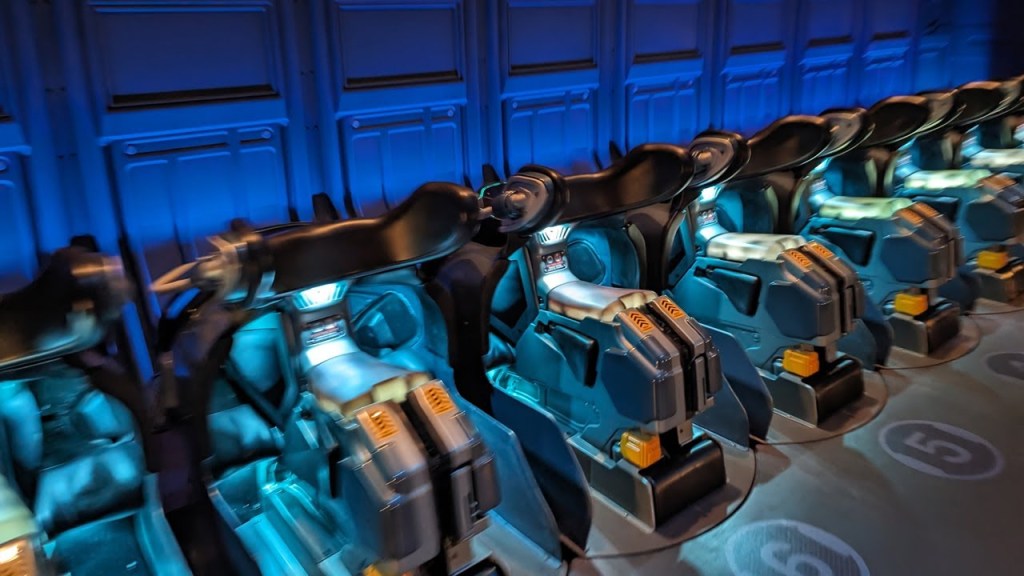
    Image links: https://www.youtube.com/watch?v=dIwTtWhdSio, https://disneyworld.disney.go.com/attractions/animal-kingdom/avatar-flight-of-passage/

    An example of how immersive experiences activate all three levels of emotional response is the ride Avatar: Flight of Passage at Disney’s Animal Kingdom as it activates all three levels of emotional response while strengthening franchise attachment. Viscerally, people on the ride are emotionally connected as they feel the breathing of the banshee between their legs and the sensation of flying through the world of Pandora. Behaviorally, they “steer” through the air currents and respond physically to the stimulation’s world. Reflectively, people who have been on the ride leave feeling emotionally moved and really feeling like they were a part of the Avatar universe. 

    Typography:

    While we might not realize it, typography is another way we are emotionally connected with shows and movies. When people see the titles to their favorite movies on posters, they might think that it is just the title when in reality it is a lot more than that. The typography in a movie poster is just as important as the typography you would see on a milk carton in a grocery store. The typography is its branding. By selecting fonts that align with the intended emotional experience, marketers create a powerful connection between the audience and the media. As busy creatures we want information that is relevant, quick, and easy to digest. An image invites our imagination to participate Without it, we would not foster any type of emotional connection with it. Not only is the appearance of a text an important consideration for brands, but the appearance of different fonts can also have psychological effects on the viewer (Brumberger). By choosing a particular font, brands can communicate one or more emotional moods. 

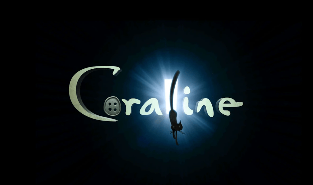
    Image: https://mystery-kids.fandom.com/wiki/Coraline_(Movie)

    While typography is important, that combined with the logo branding of a show or a movie is a great way to emotionally connect with audiences. One good example of this is for the movie  Coraline (2008). If you know this movie it is all about a 10 year-old girl named Coraline who discovers a secret door in her house to the other world. At first, she does not know it but this “perfect world” she is exposed to is full of danger. When audiences look at the font of this movie you can clearly predict and feel the uneasiness, mystery and tension that is in this movie. You can note what is important in the movie as the “o” in Coraline represents the button eyes of the other parents in the movie. Also with the “l” having a shining door, it attracts viewers to think about what could be behind the door. The cat is also important as he is the one that warns Coraline and follows her in her adventure in the other world. While typography can help us predict and feel emotions that we can feel in a film, it also gives us hints on what it can be about. 

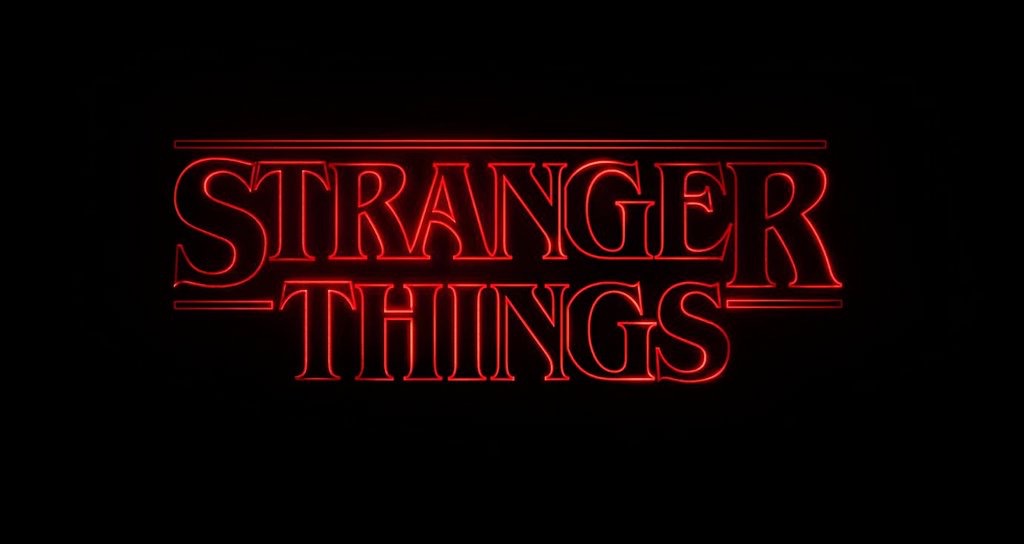
    Image: https://commons.wikimedia.org/wiki/File:Stranger_Things_logo.png

    Another example is the Netflix show Stranger Things which uses the ITC Benguiat font. As the show takes place in the 1980s, this font helps evoke a sense of nostalgia, while its curved details reinforce the mysterious and supernatural atmosphere of the series (Newsbreak). It also combines elements of Art Nouveau and Gothic lettering that evokes a sense of mystery and adventure that aligns perfectly with the show’s homage to 1980s pop culture and its blend of supernatural horror with coming-of-age drama (Newsbreak). By including this in their design you know what to expect in the show. 

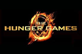
    Image: https://www.actionfonts.com/hunger-games-font/

    When it comes to sci-fi or futuristic films, a common font is used for those kinds of movies in Bank Gothic. This font conveys emotions and themes related to strengths, technology, seriousness and futurism. Movies that use this font include The Hunger Games, Iron Man, and XMen Origins: Wolverine. By knowing what types of fonts evoke certain kinds of emotions, entertainment companies can promote things to their audience the right way. While typography plays a huge role in connecting with fans so does merchandise, which we are about to get into.

    Connecting with audiences and fandoms through merchandise:

    When it comes to creating emotional connections in merchandise, a study on the Disney Store discovered something important when it comes to merchandise in entertainment. This is something very important to note as Disney is one of the biggest media companies in the world. A study specifically found that gender stereotypes are often made with the toys and merchandise they sell. Bold-colored toys, predominantly red, black, gray and brown ones and those that were action figures, building toys, weapons, or small vehicles were mainly for boys. Pastel-colored toys were predominantly pink or purple toys and those that were dolls, beauty, cosmetics, and jewelry were typified toys for girls (Mansbach). 

    This is important to note as this signifies how important it is to do research on the audience you are trying to draw in. For example, in the marketing of the first Descendants movie it was critical that Disney thinks about what colors girls will like as they will want to dress up as some of the characters from the movie for Halloween. This is why design decisions—such as color palettes, character silhouettes, or packaging typography—determine not only what sells, but which fan communities form around a franchise. Even before the toys and merchandise are made these are important decisions to make as it can affect their overall sales and the success of the movie. This also applies to Star Wars for boys and other franchises as well.

    Music:

    Music through trailers, movies and shows can also create a deep emotional connection with viewers. Because music can make us feel different emotions, it communicates meaning just like language and images. Since music can also shape emotional interpretation in film it can reinforce, expand or contradict meanings created by visual, dialogue and narration. In terms of how music can create emotion, studies have shown that the major key represents happiness and the minor key represents sadness. Just as a fast tempo can show excitement and a slow tempo shows melancholy or tension. 

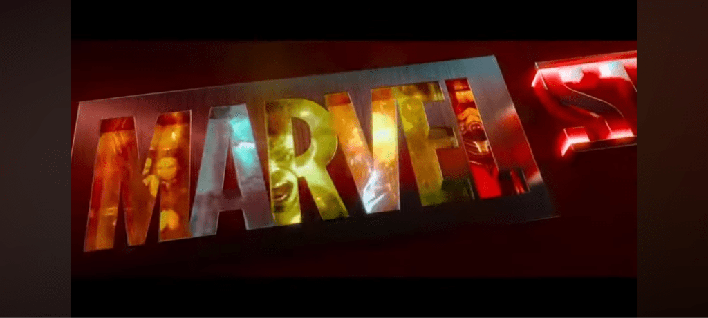
    Image: https://www.reddit.com/r/Marvel/comments/1f51zim/do_you_prefer_the_marvel_intros_with_the_comic/

    Music can also resonate with visuals that match the movie or show and allows them to make a recognizable identity with the sound. For example, the dark synth patterns that you hear in the intro to Stranger Things closely associate to the show as it is sci-fi and has a dark twist to it and the triumphant brass that is in the Marvel logo sequence give viewers a feeling of excitement. These musical signatures become part of a franchise’s branding allowing fans to identify a movie or show before any character appears on the screen (Tagg 2012).

    Websites:

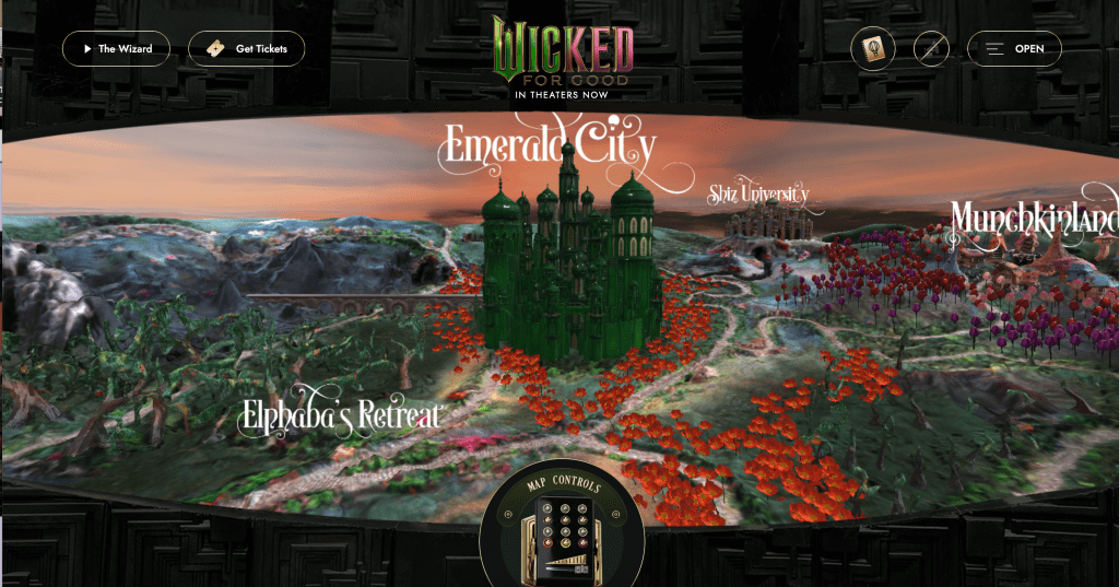
    Image: https://www.wickedmovie.com/

    Another way audiences get attached to the fandoms they love is through their websites. In order to make the websites memorable, they use the five senses — smell, touch, taste, sight, and sound. This is how we experience the world and make memories of it (Evanto). For most website visitors, the visual impact of design is the first aspect that will engage them. This is no surprise to neuroscientists, as ninety percent of information processed by the brain is visual. Research shows that the ability to recall information is much higher when there is a visual involved, when compared to an auditory-only experience.

    One good example of a multi-sensory website is the Wicked movie website. When you first go onto it you are on an air balloon in the world of Wicked. In front of you the world appears as a map having Munchkinland, the Emerald City, Shiz University, Elphaba’s Retreat, and more. It also includes details of the yellow brick road. On the website, they also include the fantastical typography that you would se with the branding of the movie. The movie’s colors are also incorporated into it using green, black, gold, and pink.

    When you click on one of the places, it allows the user to move around 360 degrees making them feel immersed in the world of Wicked. They also include music that goes with the setting which taps more into the users emotions when they use the site. By including all of this, it effectively taps into the emotions of their website’s user, making them feel that they are a part of the Wicked movie universe.

    Conclusion:

    Next time you think about your favorite movie or television show and wonder why you feel so emotionally connected to it, it becomes clear that this attachment is not accidental. Emotional design is intentional, carefully constructed through elements such as color, costuming, music, merchandise, and interactive websites. Together, these design choices work to create a sense of identity and belonging, allowing audiences to move beyond passive viewership and become emotionally invested members of a fandom. As entertainment franchises continue to expand across social media, live events, and interactive platforms, emotional design will play an even greater role in shaping how future fandoms are formed and sustained.

    Citations:

    Affuso, E., & Scott, S. (2023). Introduction: Fandom, But Make It Fashion. In E. Affuso & S. Scott (Eds.), Sartorial Fandom: Fashion, Beauty Culture, and Identity (pp. 1–16). University of Michigan Press. http://www.jstor.org/stable/10.3998/mpub.12315327.5

    Astriata. (2024, October 17). How multi-sensory web design can improve the user experience. https://astriata.com/how-multi-sensory-web-design-improves-user-experience/ (Module 4)

    Auster, C., & Mansbach, C. (2012). The Gender Marketing of Toys: An Analysis of Color and Type of Toy on the Disney Store Website. Sex Roles67(7–8), 375–388. https://doi.org/10.1007/s11199-012-0177-8

    Boone, J. (2023, December 20). Iconic sci-fi fonts from Classic Movies (and how to choose your own). Frame.io Insider. https://blog.frame.io/2017/12/11/iconic-sci-fi-fonts-movies/ 

    Clark-Keane, C. (2025, April 28). 8 ways to use color psychology in marketing (with examples). WordStream. https://www.wordstream.com/blog/ws/2022/07/12/color-psychology-marketing (From Module 3) 

    Inspiration. (n.d.). 9 iconic typefaces in movies and TV – from stranger things to napoleon dynamite. NewsBreak. https://www.newsbreak.com/creative-bloq-525073/3943953631530-9-iconic-typefaces-in-movies-and-tv-from-stranger-things-to-napoleon-dynamite 

    IxDF – Interaction Design Foundation. (2025, December 4). Putting some emotion into your design – plutchik’s wheel of emotions. The Interaction Design Foundation. https://www.interaction-design.org/literature/article/putting-some-emotion-into-your-design-plutchik-s-wheel-of-emotions (From Module 3) 

    Noad, B., & Barton, G. (2020). Emotion Resonance and Divergence: a semiotic analysis of music and sound in “The Lost Thing” an animated short film and “Elizabeth” a film trailer. Social Semiotics30(2), 206–224. https://doi.org/10.1080/10350330.2018.1543115

    Storytelling secrets for creating images that connect. Yotpo. (2025, August 19). https://www.yotpo.com/resources/5-visual-storytelling-secrets-to-improve-your-marketing-images/ (Module 6)

    The psychology of fonts: How to choose fonts that evoke emotion. (n.d.-b). https://elements.envato.com/learn/the-psychology-of-fonts-fonts-that-evoke-emotion (From Module 3)

  • Right now, I am working on my Medium.com article “How Disney Channel and Nickelodeon Create Lifelong Fans” and I am thinking about different ways to promote it. Since social media is the most popular way people consume content nowadays, I created different social media ads across LinkedIn, Instagram, and X to encourage readers to click on it.

    Instagram:

    Usually when I am on Instagram, I do not like to read too much and I like to look at graphics so I created a graphic on Canva that I think would catch the viewer’s eye. Not only that, I thought of the demographic of the people who would see this post would be and knew it would mainly people in their twenties. Because younger people have shorter attention spans, I knew color would be very important in trying to capture this audience’s attention. I also made the “Disney Channel” and “Nickelodeon” texts bigger to capture the viewer’s eye of what the post was about and included purple and yellow backgrounds. I also put a question at the top of the graphic to encourage users to engage with the post.

    Caption:

    As for the caption, a lot of my followers are either around my age and younger so I want sound more like a friend than being too formal. To do this I write in the first person and even include some emojis to make it a more personal and fun.

    LinkedIn:

    LinkedIn, usually it is more news oriented so I felt that I needed to clearly show in the graphic that my piece is from Medium.com. Because of this, I put the Medium.com logo in the bottom right corner so people can clearly see that it is a link to a full article. In the graphic, I also included a collage of Disney and Nick shows so to immediately catch the audience’s eye. Since most people on LinkedIn are very busy with their lives, I knew it was important to immediately capture their attention as for any other social media platform. To do this, I also made sure my post encouraged conversation and interactivity since the LinkedIn algorithm favors this. By including a question in the graphics as well as the caption, I know this helps increase the chances of people responding to the post to help maximize reach to people in the media and marketing industries.

    Within my caption, I also encouraged more interactivity by making the post inclusive to people of all ages in the entertainment marketing industry, even if they are not Millennials or Gen Z. I do this by making my caption general to the whole audience asking “what show defined your childhood?”

    Twitter / X:

    For X, I made a short, punchy post as people are always scrolling fast through their feed on social media. To stop my audience from passing my post, I started with the question “Remember your favorite Disney Channel and Nickelodeon shows?” This draws the person’s attention and immediately sparks nostalgia and engagement. The post also uses some emojis and hashtags to reach the target audience (Millennials and Gen Z).

    I also attached an eye catching image of the Disney Channel and Nickelodeon logos so the audience knows immediately what the article is about without even the caption. By keeping the post concise, interactive and visually interesting, I optimized it for engagement on X.

    Making these posts for my article made me aware of how there can be different audiences for each social media platform so it is important to put the right graphics and effective captions for each platform. Keeping all of this in mind can encourage and result in higher engagement rates for posts.

  • As I have been reading “On The Writing Well” and completing my internship at Girls’ Life Magazine, and completing my masters assignments, my perspective on writing has broadened significantly. I have always known that a written piece needs to flow with transitions and clear paragraphs, but I have learned the deeper layers of effective writing. I am aware of the power of a strong lead, the importance of keeping the audience’s attention at the end of each paragraph, and the value of eliminating unnecessary words and phrases.

    I particularly noticed this growth when I was writing my blog for my visual storytelling class about how TikTok hacks your brain and its behavioral economics in design. After writing the first draft of the article and going back to it, I found myself asking questions: Are my first sentences of each paragraph encouraging my reader to keep reading? Does each paragraph invite curiosity? In the paragraph about scarcity, I opened up with: “When your time is limited doesn’t it make you more anxious?” I knew that asking this question would not only capture the reader’s attention but also make the reader think about their emotions.

    Another change I noticed in myself in my writing whether it is for Girls’ Life or for my coursework is in my overall process. I now allow myself to write freely at first without trying to make it perfect. When I revisit my drafts I always find a bunch of clichés which I eliminate as they make my writing sound repetitive and unclear. Doing this helps my writing flow better. This revision process helps my writing flow more naturally. This is also important to do to keep your original voice in your writing. If you alter your writing too much just to fit your subject they might think you are talking down on them and will probably stop reading. The more confident you sound, the more your readers will enjoy reading your pieces.

  • Do you ever open TikTok for five minutes and suddenly realize it has been hours? That is not an accident. That is behavioral economics at work. The app does this on purpose through its behavioral design. In other words, the app studies your decision-making patterns and preferences so the algorithm can predict what type of content you would like to see on your “for you page.” Every like, comment, and repost becomes important data for them. When creating any type of app, especially on social media, it is important to use the easiest possible design layout to keep users engaged, which TikTok does very well.

    Infinite Scroll Feature:

    TikTok is unpredictable, which keeps its users scrolling for more. You never know what video will pop up next on your “for you” page. To keep you hooked, the app gets to know you like a friend. If you like makeup videos, the app will take notes and bring those type of videos to your page. If you like cooking videos, it will bring more of those. TikTok has that “slot machine” effect– the more content the app shows you that interests you, the longer you stay and the more money the app will make. To support this behavioral design, they make it as easy as possible to use the app so it becomes automatic to the user. This means users do not consciously think about their scrolling habits which keeps them engaged longer than they initially planned.

    Social Proof:

    Another behavioral economics principle TikTok uses is social proof. This is where users subconsciously make decisions based on what others are doing when they see a TikTok video. For example, if a user likes watching funny videos and sees the video has a lot of likes, they might stay on the video as it seems like it is popular and is worth watching. Maybe the user is interested in buying a new dress and they see one that catches their eye on their for you page. Most likely, they will save the video and come back to it later or make a purchase. Social proof makes a feedback loop that boosts engagement on a TikTok video. Since TikTok is full of short-form content, it is important to hook the user’s attention within the first few seconds. During those moments, users subconsciously decide if your video is worth their time.

    Scarcity:

    When your time is limited, doesn’t it make you more anxious? Well this is what TikTok exactly aims to do on their app. This is common on livestreams, where companies sell their products and put a countdown on them. This urges the user to jump on the sale as soon as possible as they do not want to miss out. This tactic is great for companies that use their app for business to create sales for their products. When these sales happen, users are never sure when they will see a good price on their product again so it encourages them to participate.

    Creators can also experience scarcity when a sound, filter or challenge is trending. Jumping on trends is really important as they are constantly changing. A trend that is big one week might not be as big the next. Since these trends are what audiences find to be entertaining, it is important for creators to incorporate these trends in their videos so they can be sure to get the highest engagement rates possible.

    While TikTok is designed to entertain you, you are now aware of the science behind the app. You now know why you are always scrolling for hours on end. Understanding these behavioral design strategies helps explain why apps like TikTok are the best at capturing attention and shows the power of psychology in social media. This is not just something TikTok does, it is what a lot of companies do in different ways to make sure they are staying in business.

  • Have you ever thought about how a product or experience can stir emotions and generate memories for people? Some companies care more about selling the value of customers’ experiences rather than just goods and services– and the experience economy is exactly that.

    There are different stages of the experience economy (commodity, product, service, and experience). Commodities are the earliest stage focused on raw materials, goods are the next stage that turn commodities into real products, services are the goods delivered to the customer, and experiences are what create long-lasting memories for a guest or customer. When you apply this to a specific brand, what does this look like?

    Take Disney World as an example. Their slogan is “the most magical place on earth” as this is what they aim to create for families when they are on vacation. What do they need in order to make this happen? For commodities they need the land it is built on, electricity to keep everything running, ingredients (whether it is for merchandise or food), and more. For products, they need souvenirs, merchandise (like Mickey ears or pins), food, etc. For service, they obviously need cast members who help everything run (like Photopass photographers who take pictures of families and guest relations to help guests solve their issues). For the experience stage, the most important part, it is all about transforming families’ park visits into unforgettable memories. This includes watching the Happily Ever After fireworks show at Magic Kingdom or going to the Bibbidi BobbIdi Boutique to make girls feel like a princess. Each experience is designed for their guests to feel like they are escaping the real world and being immersed in the magic.

    Something that makes the experience so magical at Walt Disney World is the design of the architecture. Every building whether you are in one of the parks or a hotel makes you feel that escape from reality. One good example is Toy Story Land at Hollywood Studios. To make you feel like you are in Andy’s playroom, this whole part of the park is designed with what look like building blocks and everything around you is enlarged to make you feel that you have shrunk and that you are one of the toys.

    Another important element of the design of the land is the colors. For Toy Story Land, Disney incorporates cheerful, bright colors like red, yellow, orange and blue to spark guests’ imagination as well as give them feelings of joy and nostalgia that comes along with the Toy Story movie. The color palette they use is not random– it is a part of Disney’s emotional storytelling.

    In terms of how they make a map as an emotional journey map they also do this in Epcot’s France Pavilion. A lot of the architecture is made to look and make you feel like you are in France along with the smells it comes along with (the smell of crepes and French food at their restaurant). Also when you go the part of France where the Ratatouille ride is, the ride also makes you feel that you are a part of the movie as one of the rats. When waiting to get on to the ride, there are sounds and music from the movie to get your imagination flowing and immerse you into the world of Ratatouille. When you get on the ride, you get into one of the rodent carts (Remy or Emile) and you are then taken in the perspective as a rat trying to steal food from Gusteau’s kitchen.

    When on “Remy’s Ratatouille Adventure,” you get positive and negative emotions. One minute of the ride you are running from chefs and fire to make you feel nervous and the next minute, you are smelling all the good food that Remy and his friends are eating in the kitchen. Stories without conflict are dull but by including these elements in the ride, this is what makes great storytelling as it takes you on an emotional journey.

    While you might not realize it, all of these elements that are a part of the experience economy are what help create the memories you make wherever you go. Disney connects design with memory turning ordinary interactions into emotional connections. This is how design adds value and why it is so important.

  • AI VERSION:

    When it comes to writing—whether it’s a blog post, an essay, or a magazine article—your introduction is everything. It’s your first impression, your chance to pull the reader in before they scroll away. A good opener can start with a question, a bold statement, or even a funny observation. The point is to make the reader curious enough to keep going. Every paragraph should build off the last one, creating momentum that makes your audience want to stay until the very end.

    As an editorial and social media intern at Girls’ Life Magazine, I’ve learned how important it is to write with intention. Every week, I create articles that speak to girls ages 10–16, which means I’m constantly thinking about what will catch their attention and keep it. With so much competing for their focus online, short, to-the-point writing is key. But it’s not just about keeping things brief—it’s about connecting through voice. At Girls’ Life, our tone is friendly and real, like talking to your best friend. That sense of comfort and trust is what makes readers come back, and it’s something I always try to bring into my writing.

    Another lesson I’ve learned is that good stories come from looking beyond the obvious. When I wrote about Meg Donnelly’s Broadway debut in Moulin Rouge!, I didn’t want to just list dates and ticket links. I wanted to tell fans something they didn’t already know—about her past performances, her connection to the show, and moments they could look forward to. Those extra details make readers feel like they’re getting an insider look, and that’s what keeps them hooked.

    Whether you’re writing for a magazine, a blog, or even a school paper, the same rule applies: strong openings, authentic voice, and deeper research make your writing not only stand out—but stick.

  • NO AI VERSION:

    Whether it is a blog, an essay, or a magazine– it comes to writing anything, it is important to have a strong introduction and include details that interest the reader in your topic. You could start it as a question, with humor or as a paradox, etc. As you are writing, the most important thing is to keep your reader hooked at the beginning and the end of the paragraph. Every paragraph should amplify the one that preceded it. It gives your reader a reason to stay. To make sure your writing is smooth,

    As someone who is an editorial and social media intern at Girls’ Life Magazine, this was helpful for me to learn as I am someone who is writing different articles every week. As this is my first time writing for a magazine, I constantly have to put my self in the shoes of girls ages 10-16 in how they would approach reading this article. Since young kids nowadays, especially as they are growing up with technology, have short attention spans, I have realized it is important to keep my writing short and to the point. But when starting an article something I always have to ask myself is– what is the best way to pull them into the piece? Besides putting a question in the beginning, something I noticed that I think pulls the reader into your piece is your voice in the piece. The goal of Girls’ Life is to make young girls feel like we are their best friend. It gives them feel a sense of comfort in knowing we got their backs and that is what also has them coming back for more.

    Another thing I realized is very important when it comes to writing for a magazine, especially when it comes to entertainment or news pieces is to look for material everywhere on a topic not just the obvious sources. For example, when I did my article on Meg Donnelly’s broadway debut in Moulin Rouge, I had to find more information about the show. Instead of just finding the obvious information of the dates she will be in the show and when tickets go on sale, I did deeper research on some of her past credits in acting as well as what the show is about and some moments in the show fans of hers will be excited about. When you include information that isn’t obvious it gets your audience excited to know about more information. I personally know when a show comes out, I want to know all of the details and this is exactly my point. When you include information others did not know about, it makes your piece stand out and keep your audience hooked.

    When including these writing strategies in an essay or an article for a magazine, it will for sure making your piece more effective and draw the reader in for more.

  • As someone who works in entertainment marketing / social media strategy, I constantly have to think about how certain posts will perform now and in the future. This is where I have to use scenario planning and the cone of plausibility. After learning about these two concepts, I realized that these things can also be applied to social media strategies.

    Scenario Planning In Social Media:

    When it comes to scenario planning, as an editorial and social media intern for Girls’ Life Magazine and someone who runs my own young entertainment social media account (@emilieacktv), I constantly have to think about different scenarios of how my posts could perform.

    For example, the video I made about Disney’s Zombies 5 being in the possible early stages of development, the likely scenario is that it will reach my current followers who are fans of the Zombies franchise. In a plausible case, the algorithm on Instagram and TikTok could expand my videos to other Disney Channel fans who have yet to have discover my page or in a wild case, it could be reposted or noticed by bigger creators or go viral.

    Sometimes, a post might not do as well as I hoped so in this case I would think of how to improve my next entertainment news post. I reflect on what possibly could have caused these results — hashtags, timing, too much blabbering, etc. Through scenario planning, it helps me to anticipate multiple outcomes so I can respond quickly, adjust my strategy, and keep building momentum. This approach helps me create more engaging content for Girls’ Life Magazine and my own audience.


    Zombies 5 is in the current stages of development? (Click to view!)

    Cone of Plausibility in Social Media:

    As for the cone of plausibility, it can help me determine how simple or bold I want to go with my visuals for the video. A likely approach would be me doing a simple news clip with basic visuals. A plausible approach would be me including some animated graphics or making fun comparisons to Disney movies. A wild approach could be a short cinematic teaser with fan theories, fun predictions, and or special effects.

    Sometimes taking the wild approach in social media can be better as the algorithm favors unique and interesting content that will make the audience want to stick around for more. This where design of the future comes in. When I experiment with colors, movement, and layout, I am designing how my audience might experience entertainment content years from now.

    Visual design plays a big role in how audiences interpret my videos. The better the graphics look, they are more likely they will be shared, which helps shape the future of entertainment storytelling online.

  • When it comes to writing for yourself and your audience, the most important thing to remember is to keep your writing style but also know who you are writing for. As publications like magazines and newspapers never want you to write in first person, this makes it more difficult to show your voice and personality in your writing. However, you should never overthink what the audience or editors want to see. Relax, be yourself, and come back and edit afterwards.

    Learning all of this opened my eyes as I am a current editorial and social media intern for Girls’ Life Magazine. The mission of Girls’ Life Magazine is to inform, inspire, and entertain girls around the globe– whether that is entertainment, beauty, lifestyle and more. They want tween and teens readers to have someone who gets them. For many of the pieces I write for them, most of the articles are in second person to achieve this. For example, in one of my articles “How Pattern Mixing Can Instantly Upgrade Your Frosty Fits,” I write, “Don’t worry bestie we are here to help!” This kind of tone builds trust and loyalty so girls see Girls’ Life Magazine as a brand that speaks their language.

    When it comes to writing articles for them and keeping my voice– I do notice that this is easier for me to do as many of the things I write about I am passionate about. However, I do notice that since I cannot put in my writing “I am so excited for this movie” I spin it into the language for Girls’ Life saying “we” instead. Second person makes readers feel included, understood, and a part of the community which is exactly what they want to do. I try to make my style sound friendly and confident, like the way I would talk to a friend. It also keeps readers engaged and prevents them from getting distracted.

    This also applies to me when doing copywriting for social media. This has shown me that this does not just apply for writing articles but when connecting with readers in other mediums. Whether I am creating posts for Girls’ Life or my own entertainment social media, putting my posts in second person or using inclusive language help my posts feel like a conversation, keeping my audience engaged while still including my personality.

    Something really important I have learned from all of this is that writing is not all about perfection. It is about getting down what you want to write without stressing so your voice comes through the piece naturally. Sometimes I am determined to get it right the first time, but I have learned what truly matters is getting down your thoughts first and then edit to have my authentic voice shine even if it isn’t in first person.

    Check out one of my articles from Girls’ Life Magazine that illustrates this!

  • At Girls’ Life magazine, I write editorial pieces covering entertainment, beauty, style, and lifestyle topics. I also help manage the magazine’s social media presence for its 162K+ following, contributing to posts and digital strategies that strengthen engagement with readers. I collaborate with the editorial team to brainstorm new story ideas, stay up to date on pop culture and beauty trends, and ensure all content aligns with Girls’ Life’s creative voice and mission.

    Editorial Pieces I’ve Written: